The One Color Outfit: Tonal Dressing Done Simply
Some outfits look effortlessly considered, and the trick behind many of them is not complexity but simplicity. The same color, worn from top to bottom, in slightly different tones and textures. The result reads as elegant, confident, and quietly modern. It is one of the easiest formulas in dressing, and one of the most reliably flattering.
Tonal dressing has been a feature of well dressed wardrobes for decades, and it has only become more useful as casual dressing has shifted toward minimalism. The one color outfit is the answer to a wardrobe full of mismatched pieces and the question of what to wear.

What tonal actually means
Tonal does not mean identical. The most beautiful one color outfits play with slight variations within the same family. Cream with ivory with soft white. Camel with caramel with chocolate. Soft sage with deeper olive. The colors are clearly related, but the slight differences create depth.
Texture does similar work. A cream linen trouser with a cream silk tank with a cream knit cardigan reads as tonal even though the fabrics are entirely different. The shared color holds the outfit together; the textures keep it from looking flat.

Why it works so well
The eye reads a tonal outfit as a single coherent statement rather than a collection of separate pieces. That coherence is what makes the outfit feel considered, even when the individual pieces are simple. There is no clash, no competition, no question of whether the pieces work together. They obviously do.
Tonal dressing also lengthens the line of the body. An outfit broken up by contrasting colors visually divides the figure. A continuous color from top to bottom creates a longer, smoother visual line, which tends to be flattering on nearly every body.

Where to start
Cream is the easiest tonal palette and a particularly good place to begin. Cream linen trousers, a cream tank, a soft cream cardigan or blazer, a tan leather sandal, a straw bag. The outfit reads as fresh, summery, and entirely intentional.
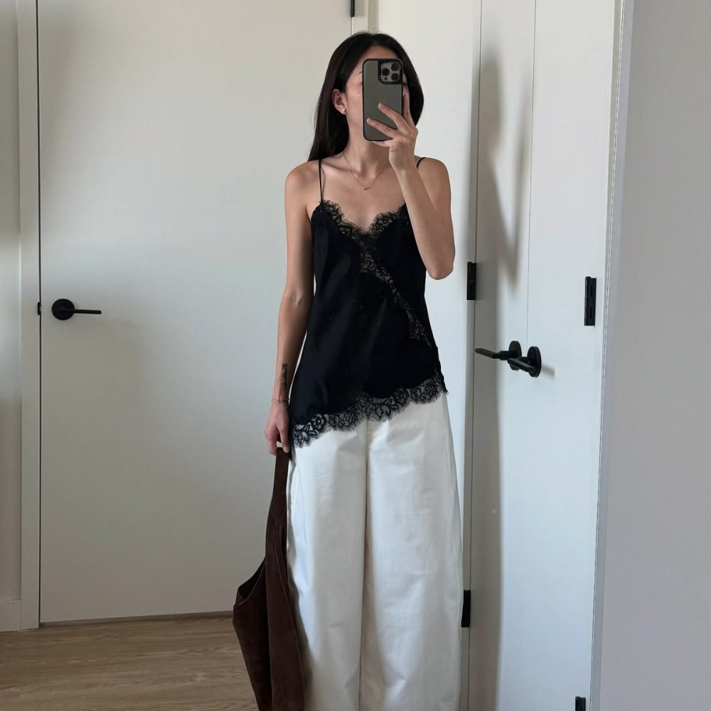
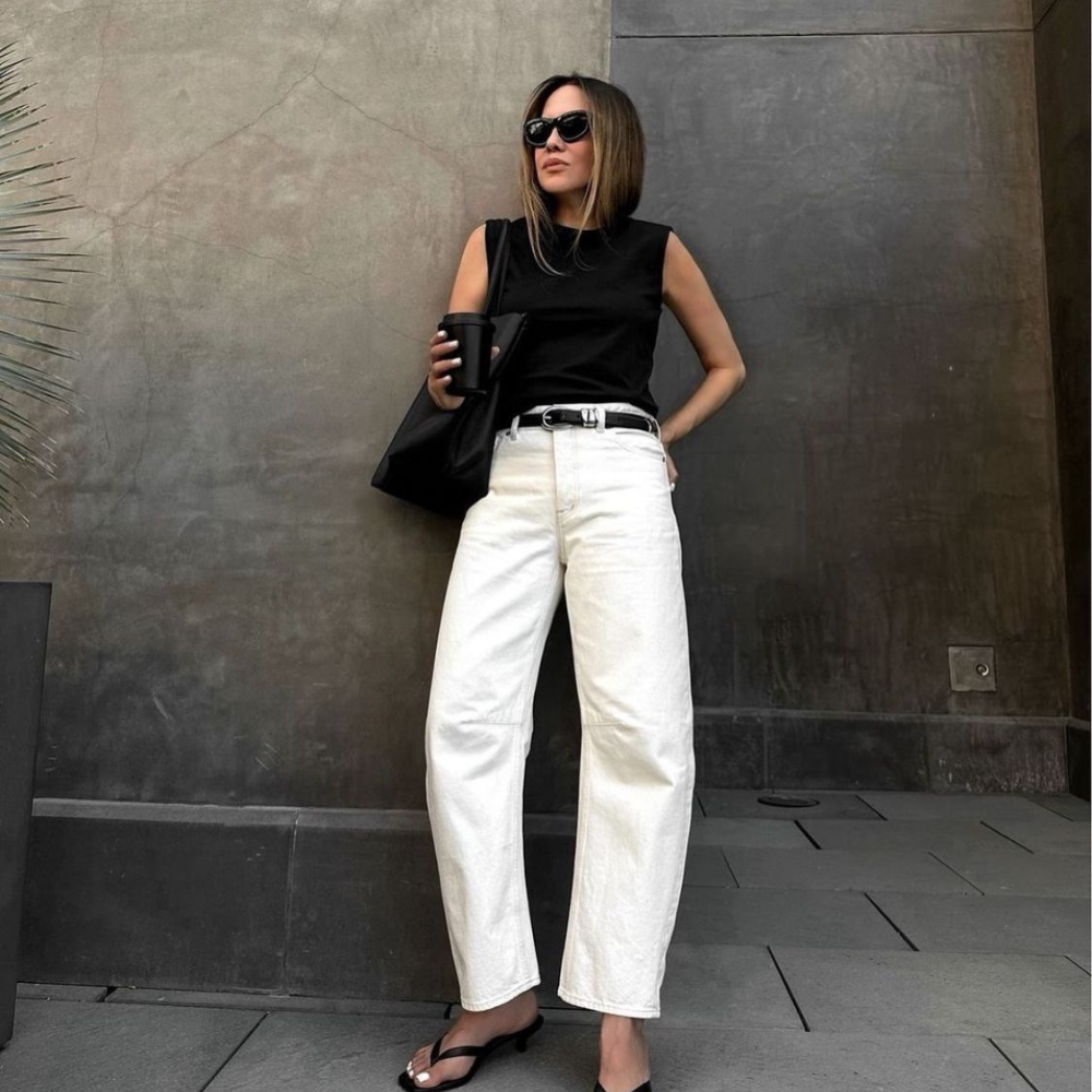
Black is the most flattering option for many people and reads as immediately polished. Black trousers, a black tank, a black light layer, finished with quiet accessories. The result is elegant and timeless.
Brown is the most current. A soft caramel trouser, a deeper brown tank, a tan blazer, brown leather accessories. The palette is warm and rich without being heavy, and it photographs beautifully.

The role of accessories
Accessories in a tonal outfit can go two directions. They can continue the palette, staying within the same family for a fully unified look, or they can introduce a single contrasting element for definition.
The fully tonal approach reads as the most refined. Cream outfit with cream bag, cream sandal, pearl or gold earrings. The outfit looks deliberate and high end. Nothing competes.
The single contrast approach introduces one different color, often through one piece. A cream outfit with a black bag. A camel outfit with a navy earring. The contrast adds interest without breaking the overall unity. Just one contrast, though. More than one starts to undo the tonal effect.

Texture is the secret
What separates a beautiful tonal outfit from a flat one is texture. Combining different fabrics within the same color is what creates dimension. A linen and a silk together. A knit and a cotton. A leather and a soft wool. The variety in surface keeps the outfit visually interesting even though the color does not change.
This is also where the outfit becomes seasonal. In summer, the textures lean light and airy, linen, fine cotton, silk, soft leather. In autumn, the same tonal approach uses heavier wool, suede, knit. Same idea, different season.

Common pitfalls
The biggest mistake is choosing pieces that are too close in color without enough variation in texture. A cream cotton tee with cream cotton trousers in nearly identical fabric tends to look like pajamas. Vary the fabric, the tone slightly, or both.
The second mistake is treating the outfit as truly identical. Pieces that match exactly often look like a set rather than an outfit. Slight variation is the goal, not perfect uniformity.
The third is breaking the tonal effect with the wrong accessory. A bold colored bag in the middle of an otherwise tonal outfit pulls the eye and disrupts the coherence. If the accessories contrast, contrast deliberately and minimally.

The case for it
The one color outfit is the closest thing to a guaranteed elegant result in dressing. It is forgiving, flattering, and almost always reads as intentional. It works for casual days and for elevated occasions. It photographs beautifully. It feels coherent.
Best of all, it is easier than most outfits, not harder. There is no question of whether colors clash. There is no need to coordinate disparate pieces. Pick a color, build the outfit within its family, add a single quiet contrast or none at all. The result is consistently better than the effort suggests.
Laisser un commentaire
Ce site est protégé par hCaptcha, et la Politique de confidentialité et les Conditions de service de hCaptcha s’appliquent.